flex布局

基本概念

容器属性
1、flex-direction (方向)
.box {
  flex-direction: row | row-reverse | column | column-reverse;
}
- row: 主轴为水平方向,起点在左端

- row-reverse: 主轴在水平方向, 起点在右端

- column: 主轴在垂直方向, 起点在上端

- column-reverse: 主轴在垂直方向, 起点在下端

2、flex-wrap
如果一条轴线排不下,如何换行
.box{
  flex-wrap: nowrap | wrap | wrap-reverse;
}
- nowrap(默认): 不换行, 会挤压
item宽度

- wrap: 换行, 第一行在上面

- wrap-reverse: 换行,第一行在下面

3、flex-flow
flex-flow其实是flex-direction和flex-wrap的简写方式, flex-flow: row wrap
.box {
  flex-flow: <flex-direction> || <flex-wrap>;
}
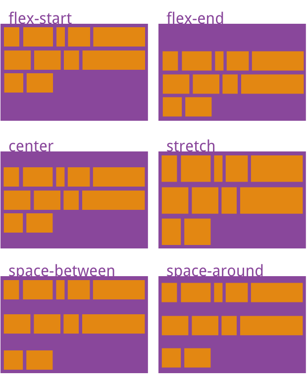
4、justify-content
定义了项目在主轴上的对其方式(X轴)
.box {
  justify-content: flex-start | flex-end | center | space-between | space-around;
}
- flex-start(默认值): 左对齐

- flex-end: 右对齐

- center: 居中

- space-between: 两端对齐, 项目之间间隔都相等

- space-around: 每个两侧间隔相等,项目之间的间隔比项目与边框的间隔大一倍

5、align-items
align-items属性定义项目在交叉轴上如何对齐。(Y轴)
.box {
  align-items: flex-start | flex-end | center | baseline | stretch;
}
- flex-start: 上起点

- flex-end: 下起点

- center: 中点

- baseline: 项目的第一行文字的基线对齐
- stretch(默认值): 如果项目未设置高度或设为auto,将占满整个容器的高度
6、align-content
多根轴线的对齐方式。如果项目只有一根轴线,该属性不起作用
.box {
  align-content: flex-start | flex-end | center | space-between | space-around | stretch;
}
项目的属性
- order: 排序
  .item {
    order: <integer>;
  }
- flex-grow *
- flex-shrink
- flex-basis
- flex
flex是flex-growflex-shrinkflex-basis的简写,默认值为0 1 auto。后两个属性选填
- align-self
- 如果没有设置,则继承父级的
align-items,如果设置了,则覆盖父级。
- 如果没有设置,则继承父级的
兼容性
